Implementation
In addition to the prerequisites above, the following steps will get Checkout Plus up and running on your store.
Supply your store domain(s) to be added to the API allow list
To prevent Checkout Plus from inadvertently being placed on the wrong store, the “Origin” header is examined on any requests to ensure a match with the storefrontId. Any number of domains can be added to support testing across different environments, etc., but the domains should all be associated with the store that the GSP app is installed to.
Note that a referrer of “localhost” is always allowed, which will allow the widget to function normally if you are developing locally.
Copy The Script From Corso
Navigate to Corso Admin > Settings > Checkout Plus.
In the Checkout Plus Script section, you will see a clipboard icon. Click this button to copy the Checkout Plus script.
Place the Corso <script> tag
To integrate Checkout Plus, paste the copied script on any page where Checkout Plus should appear. The script should generally be placed inside of the <head> element. The script can safely be placed globally, as the display of the widget is controlled in the next step.
The script will look something like this:
<script
  async
  src="https://cdn.corso.com/js/corso-checkout-plus.js?shop=[yourstore].myshopify.com&sfToken=[YourStorefrontToken]"
></script>
Note that all attributes on this element are required.
Configure Checkout Plus with specific selectors from your theme
There are 4 assets needed for Checkout Plus which require specific HTML element selectors to place them properly.
- Checkout Button
- Opt-out-button
- Pricing Info
- Cart Line Items Container
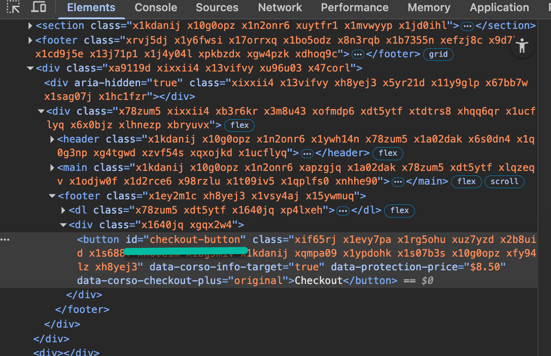
Checkout Button
For the Checkout button, by default we will look for any <button> that has an attribute of name="checkout" but we recommend adding a unique ID to the checkout button. Here is an example of what we are looking for on each checkout button in your theme.
Opt-out-button
Typically the opt-out button goes directly below the checkout button and often we can place the opt-out button directly beneath the checkout button without any additional placeholder snippets. However, depending on your theme, you can add a specific <div> element to your theme directly underneath the checkout button.
Here is the default placeholder that we would observe for the opt-out button:
<div id="corso-checkout-plus-button"></div>
Pricing Info
This is placed similarly to the opt-out button. Typically the pricing info goes directly above the checkout button and often we can place the pricing info directly above the checkout button without any additional placeholder snippets. However, depending on your theme, you can add a specific <div> element to your theme where you would want the pricing info to be placed.
Here is the default placeholder that we would observe for pricing info:
<div id="corso-checkout-plus-info"></div>
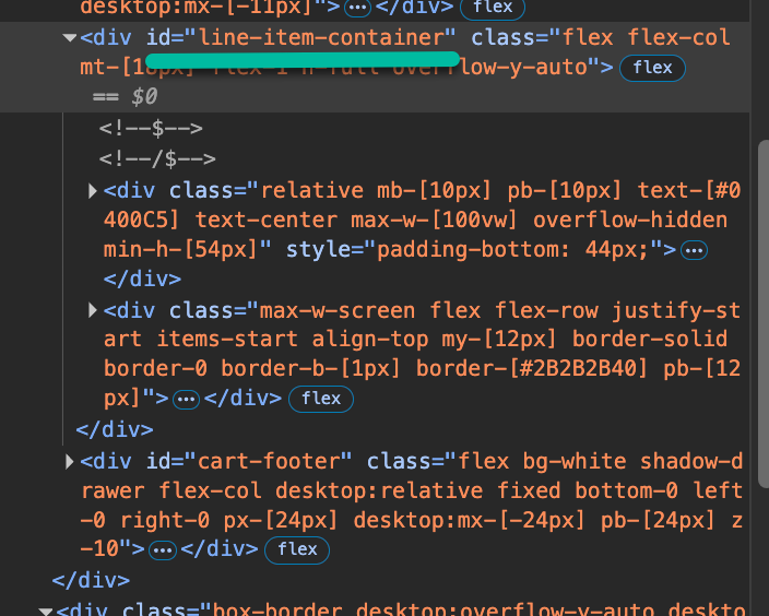
Cart Line Items Container
To recognize changes to the cart, we observe the cart to identify if a change has been made. This allows us to requote the cost of shipping protection and re-render the checkout plus assets as needed. Adding a unique id to an element that wraps the cart line items is needed for this. In this example, each of the child <div> elements are the cart line items.
Style the widget
For styling, we copy your checkout button so those styles should stay the same. For the pricing info and opt-out button, we support custom CSS or we have CSS variables that can be applied. Refer to this document for styling Checkout Plus.
Testing & Troubleshooting
To test and troubleshoot, you can run "Corso.enable()" in the dev console to test Checkout Plus for your browser session. Refer to this guide for testing and troubleshooting. this document
Go Live
When everything looks good, you can go into the Corso admin setting for Checkout Plus and turn it on.